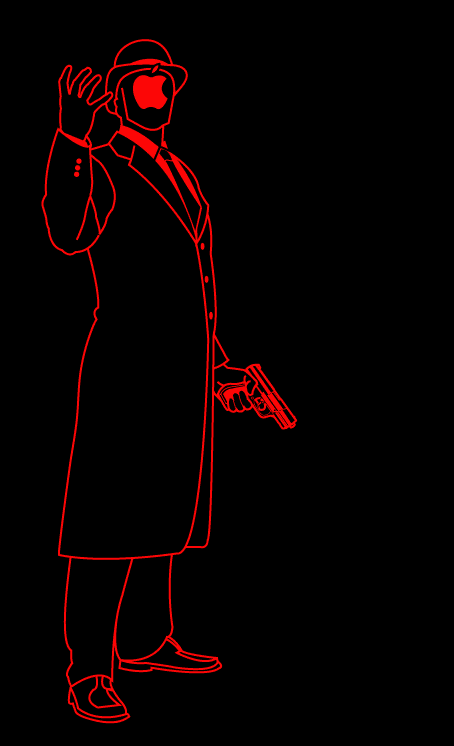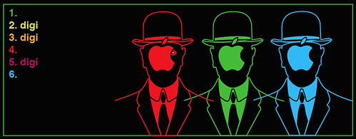
I've been distracted from the 9-11 updates by the artwork creation for my personal website's splash page. Here's a taste. For two more click after the JUMP.

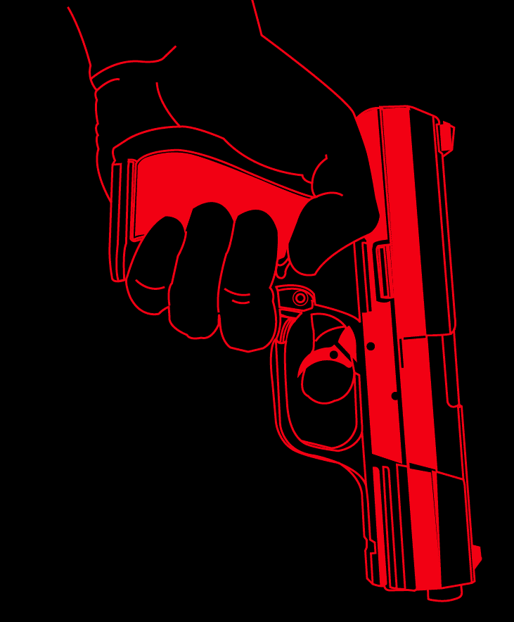
This is a close up detail of the fire-arm red is holding. Its based off a photograph of a friend's pellet gun, a prop I might have to steal from him due to how well this turned out. The problem with illustrator is that you can get highly detailed images at large scale, but when shrunk the images tend to get chunky. The more detail, the more muck you have to pick through to see what you can keep and what you have to get rid of.

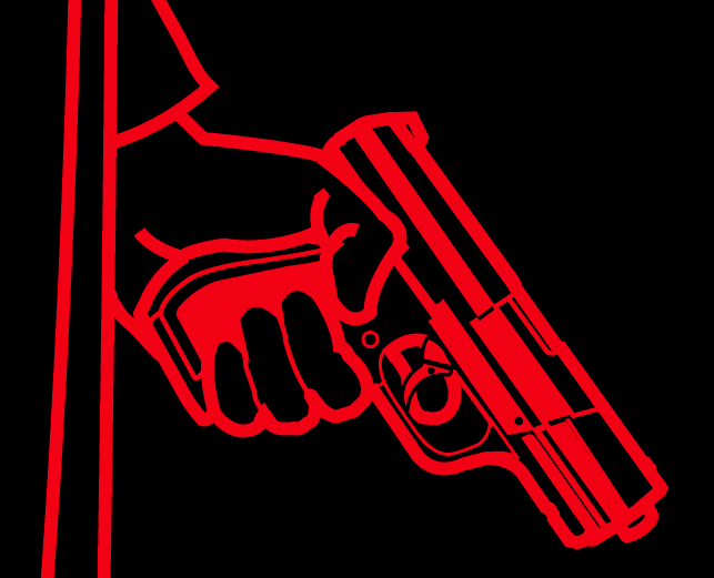
This is the end result of the "human sacrifice" ritual I had to perform on the gun. But to tell you the truth, I like it alot better than the detailed one. Its got this chunky iconic Frank Miller feel to it. It lost a lot, but gained alot in the long run. More than likely, I might keep the rest of the development under wraps till the site is up. I know I know... all TWO of you are disappointed.

No comments:
Post a Comment